Toohey Trail Run Event Graphics

Translating Topography, Wildlife, and Atmosphere into a Cohesive Visual Design
This project responds directly to the physical and ecological qualities of Toohey Forest. The design integrates hand-traced topographic lines with outlines of native animals including a kookaburra, koala, and bearded dragon. These elements form a subtle visual layer that reflects the biodiversity of the area and invites closer inspection.

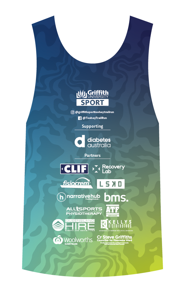
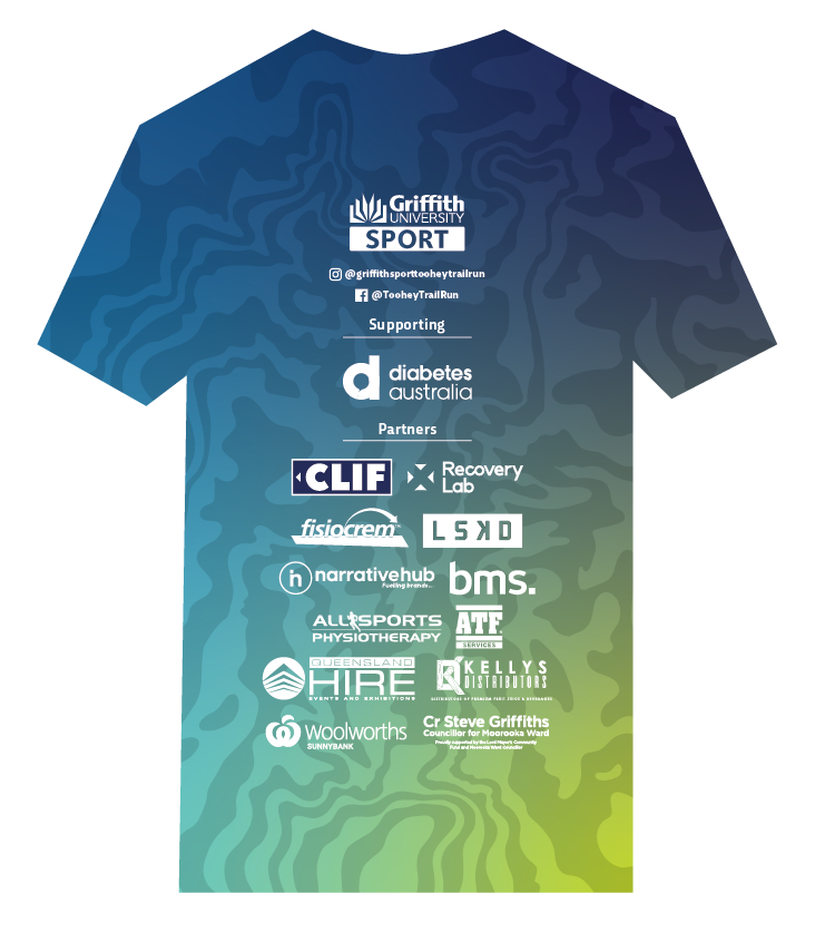
A green-to-cyan gradient suggests the vertical shift from forest floor to open sky. This colour approach supports a visual system that is adaptable across singlets, medal ribbons, social media content, and a customised event logo. The result is a balanced identity that captures the rhythm of the terrain and the atmosphere of the trail. It connects runners to place through a design that feels embedded in the environment rather than applied to it.
Research and testing shaped each part of the outcome. Early exploration focused on event singlet design, using low-contrast patterns with bold visual anchors to build hierarchy without overwhelming the form. As the project developed, attention shifted to how the identity could carry across platforms while maintaining clarity and texture. Rather than introduce complexity through ornament, detail emerged through spatial relationships and subtle shifts in colour and line density.
The final design encourages interaction and curiosity. Animal forms are placed within topographic contours to reward a closer look, while the gradient builds a sense of momentum and elevation. Each asset remains consistent with the broader identity, but is responsive to format and context. The project emphasises clarity, restraint, and connection to place; qualities that reflect both the event and the environment it moves through.